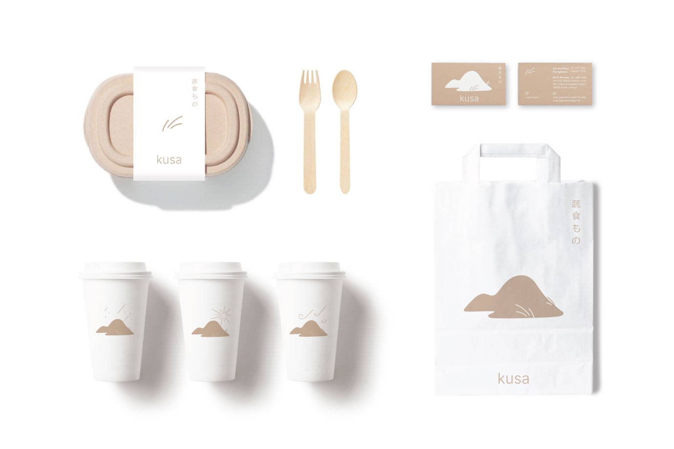
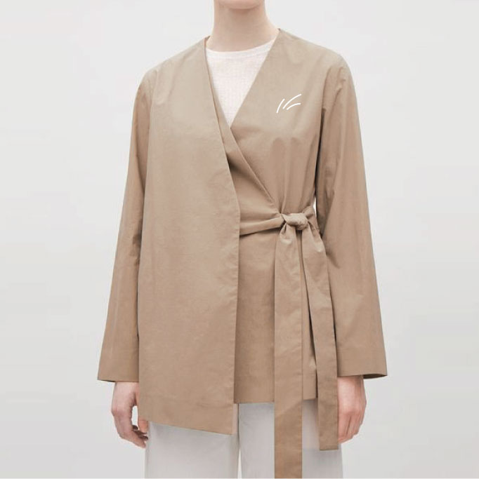
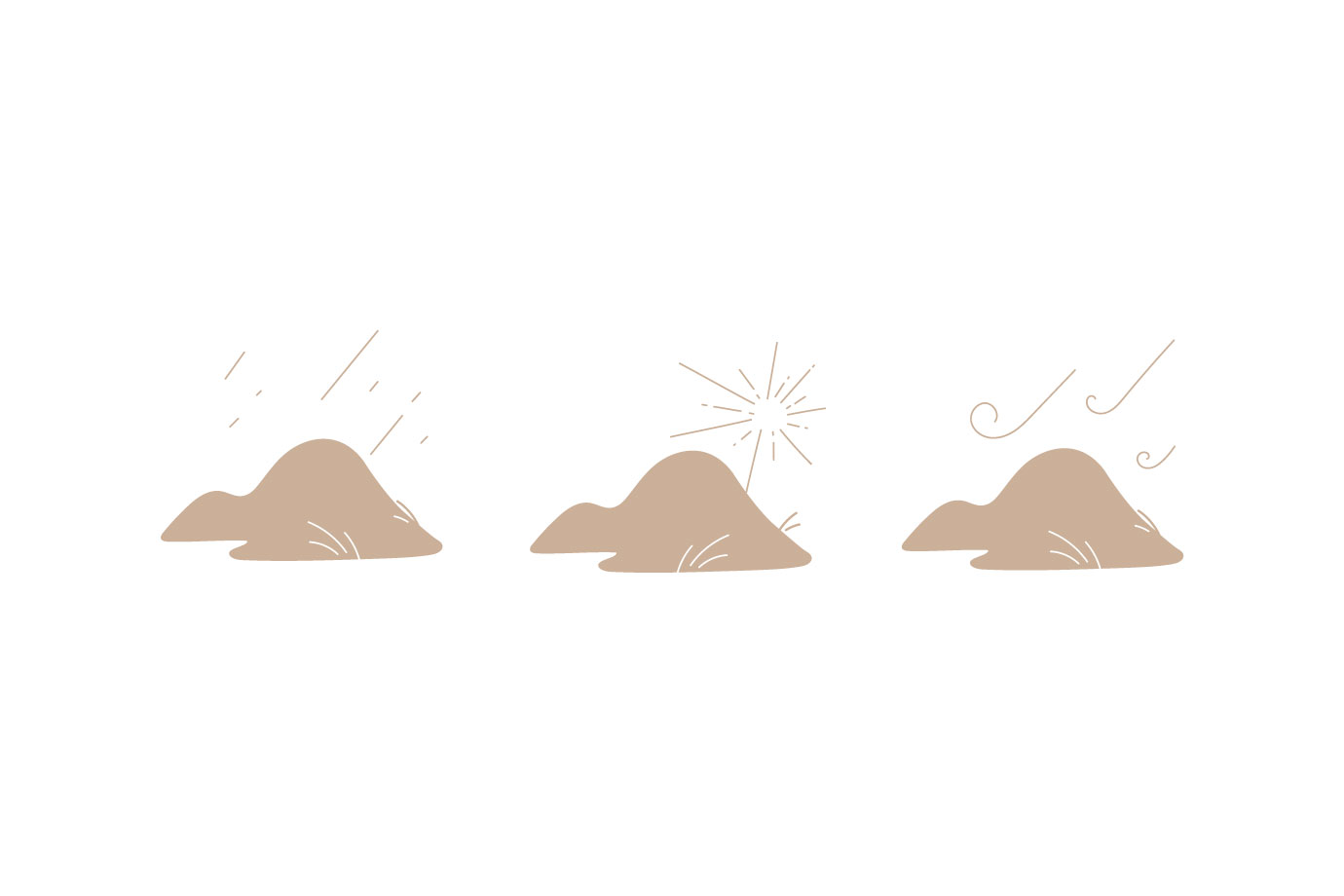
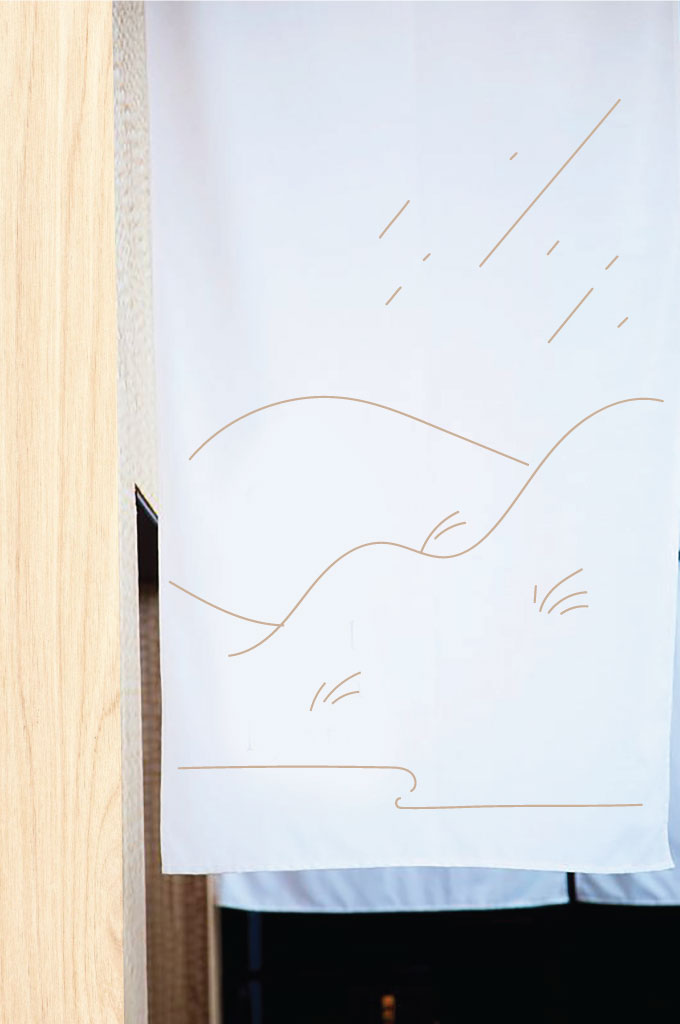
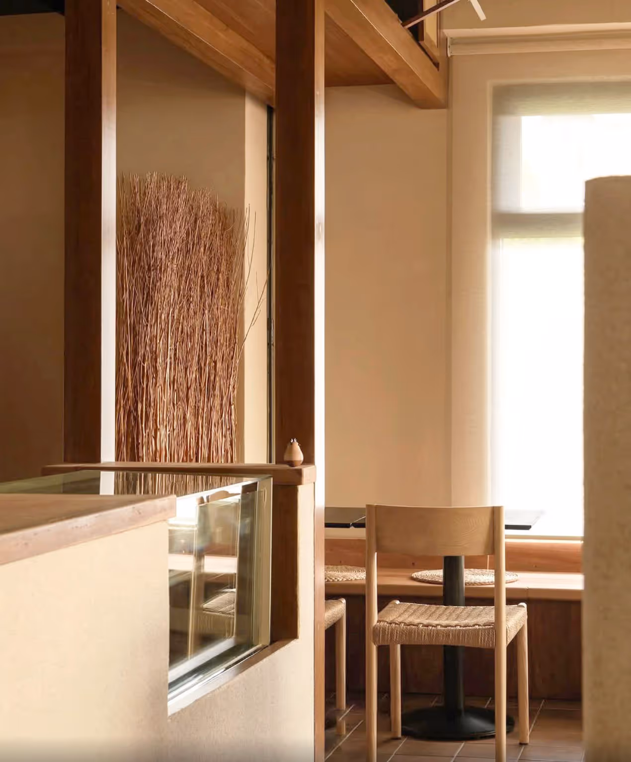
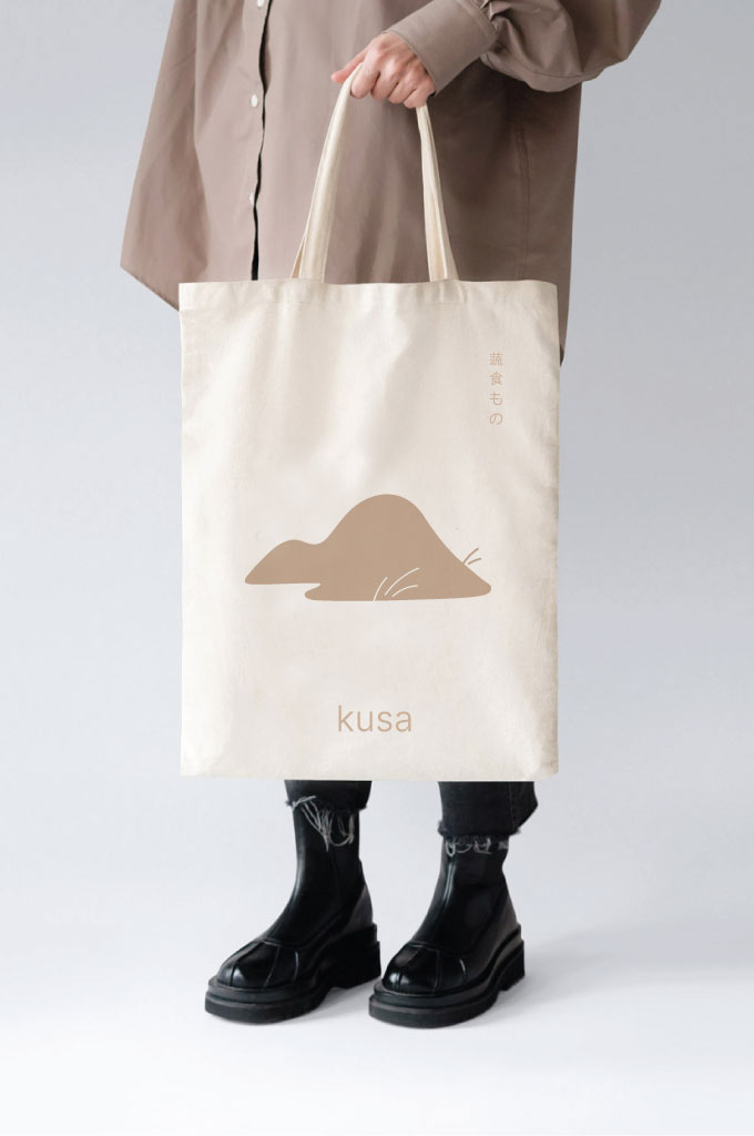
Kusa is a plant-based Japanese restaurant in Kuala Lumpur, embodying a distinct expression of nature, nourishment, and gentle resilience. When we were invited to craft its brand world, we began with the spirit of its founder: a woman who stands strong in all seasons, like a reef in the wetland. This resilience, rootedness, and grace in the face of adversity became our guiding inspiration.
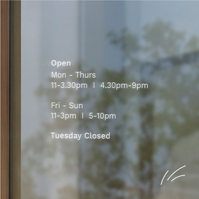
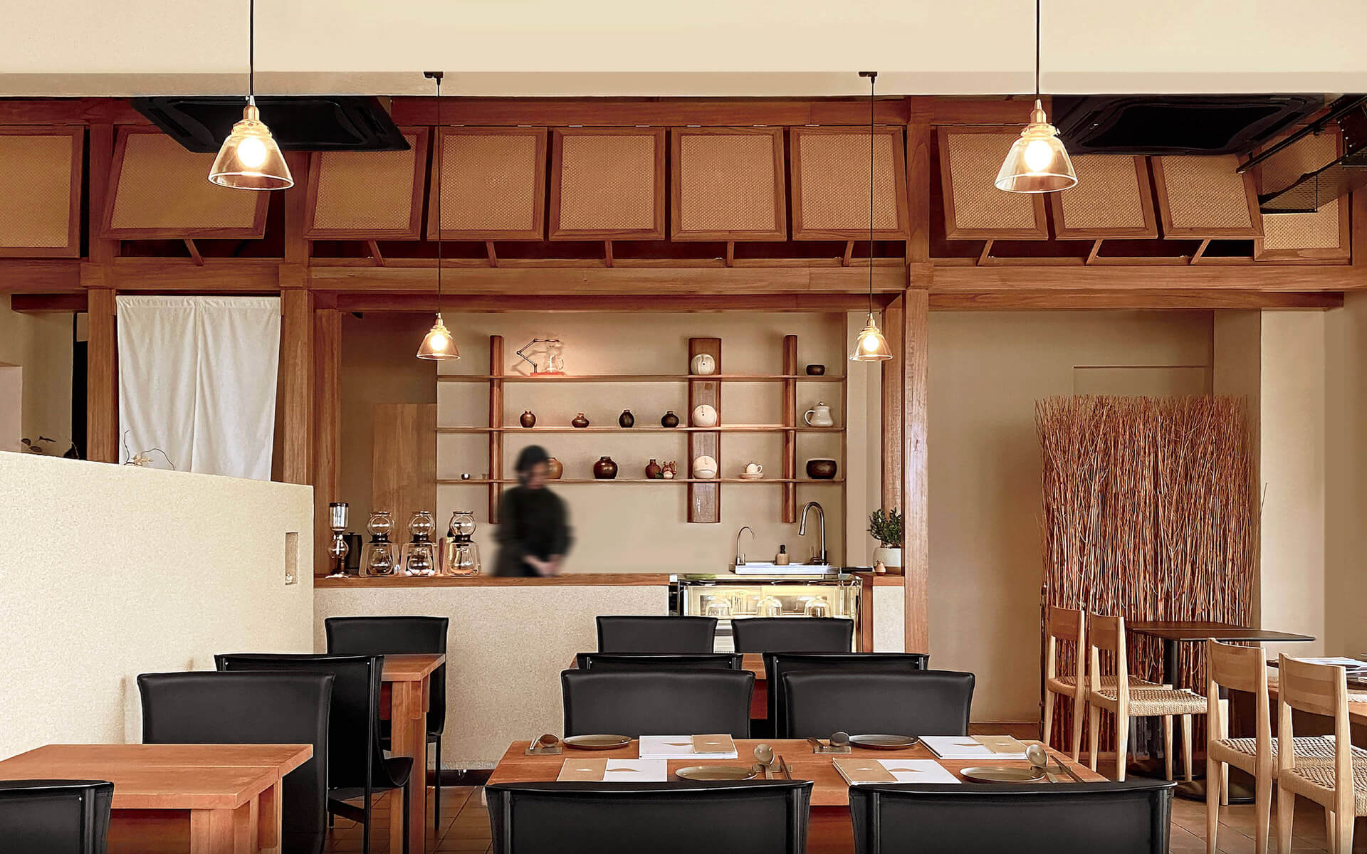
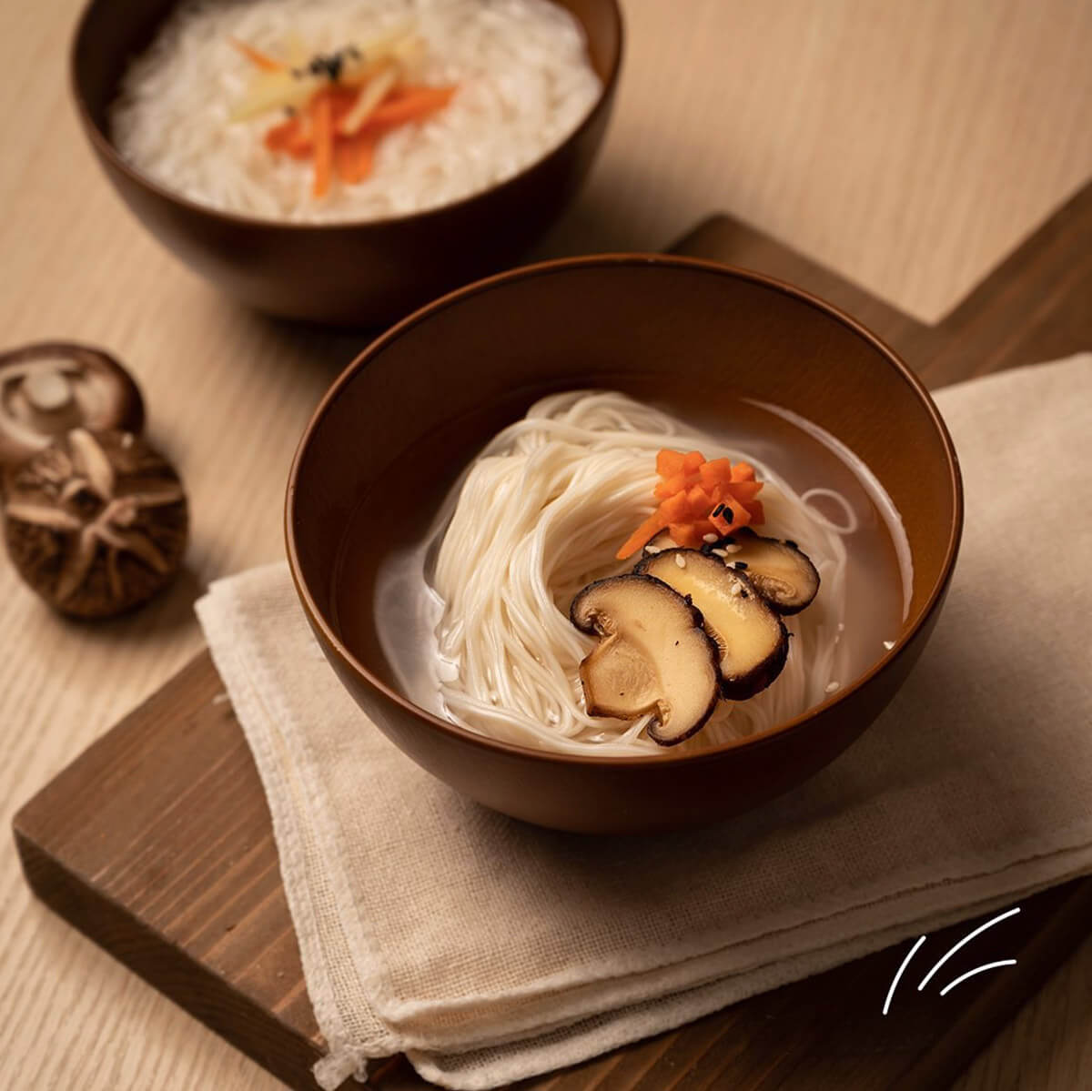
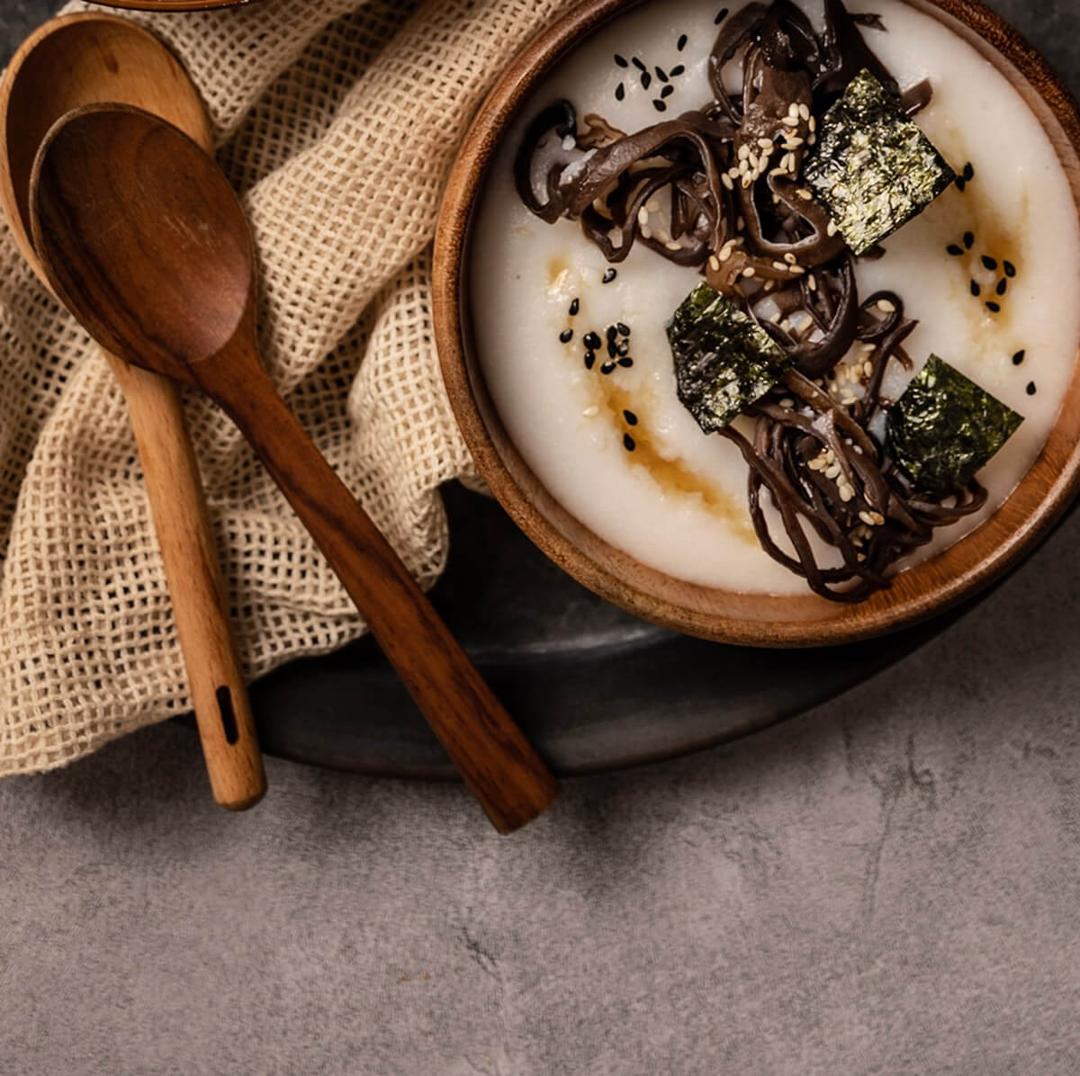
Kusa is a space for contemplation, comfort, and slow nourishment. A place that moves with the seasons, but always feels like home.
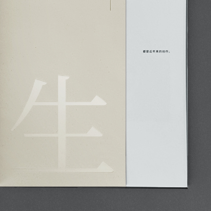
At its core, Tan Puay Tee’s collection of artwork, bound in a three-part book, is a vessel of memory and devotion in honour of his beloved wife.
Our challenge was to shape a design that could hold this depth of sentiment with clarity and care. We approached the book as a gift that held the journey of remembrance.
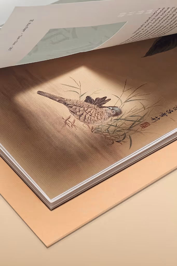
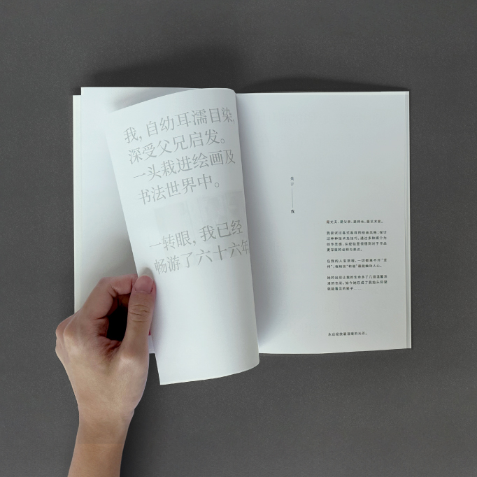
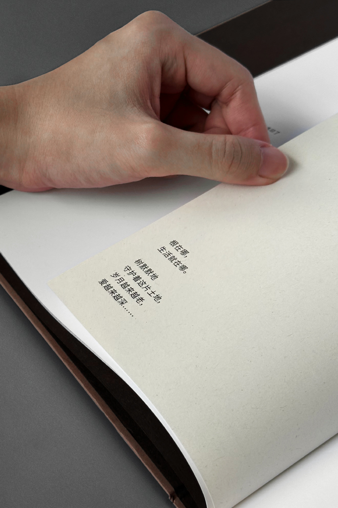
We designed the book to echo this unfolding perception. Three chapters trace her vision, while die-cut windows and folded inserts shift scale and perspective, mirroring the act of looking closer, deeper, and differently.
The typography is deliberately understated to serve asa quiet companion to each imagery. From material to layout each book echos the artist’s own intent and pace, to create a work that is both an archive and a love letter.
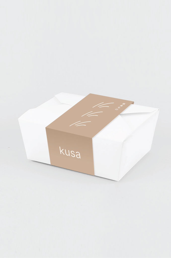
Kusa’s identity pays homage to nature’s gentler side—muted palettes, organic lines, and soft gradients reminiscent of light and wind rolling over hills.